The Best Paint Colors for Small Spaces: Creating a Spacious and Inviting Environment by Hashtagdesignstudio

One of the most effective ways to transform a small space is by choosing the right paint colors. The right color can make a room feel larger, brighter, and more welcoming. With so many options available, selecting the best paint color for your small space can be overwhelming. This comprehensive guide will walk you through the best paint colors for small spaces, covering various shades, their effects, and tips on how to use them effectively.
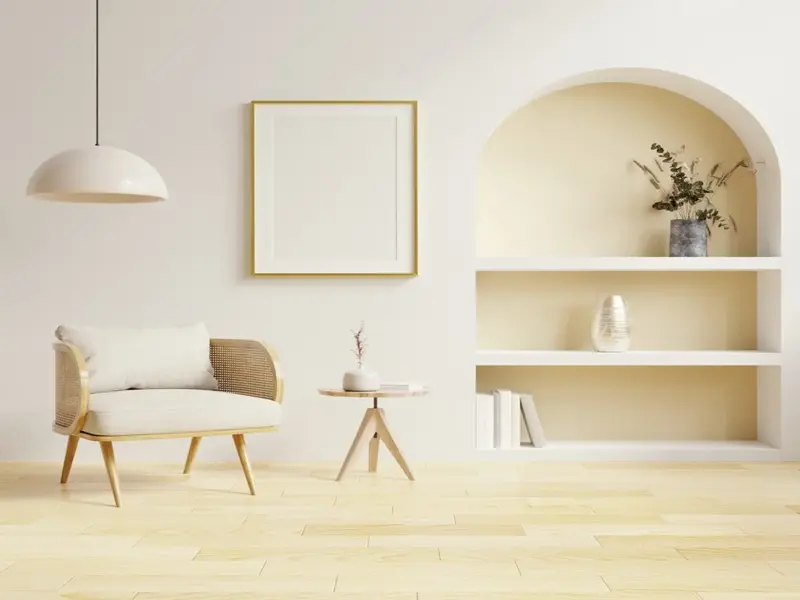
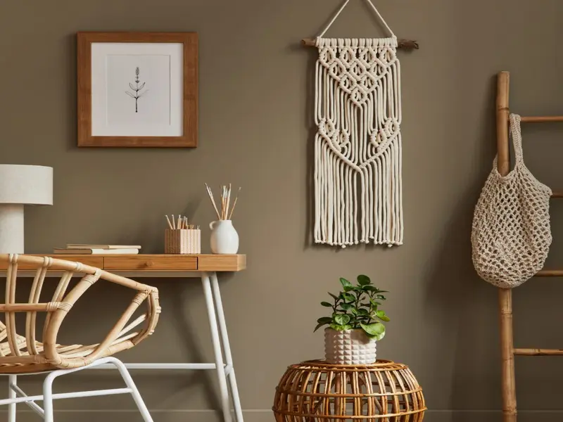
1. Light and Bright Neutrals
Light and bright neutral colors are a popular choice for small spaces because they reflect light, making the room appear larger and more open.
Key Shades:
- White: Crisp and clean, white walls can make any space feel airy and expansive. Learn more about using white in small spaces on Elle Decor.
- Off-White: Slightly warmer than pure white, off-white adds a touch of warmth while maintaining the spacious feel. Find inspiration on Architectural Digest.
- Light Gray: Elegant and versatile, light gray is a great alternative to white with a bit more depth. Explore more on House Beautiful.
- Beige: Warm and inviting, beige creates a cozy atmosphere while keeping the space feeling open. Discover more on The Spruce.
How to Use:
- Ceilings: Paint the ceiling the same color as the walls to create a seamless look that elongates the room.
- Trim and Molding: Use a slightly lighter or darker shade for trim and molding to add subtle contrast without breaking the continuity.
- Furniture and Decor: Use matching or complementary colors for furniture and decor to maintain a cohesive look.
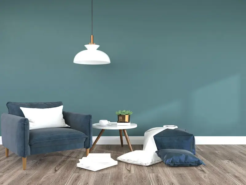
2. Cool Blues and Greens
Cool blues and greens are calming and refreshing, making them ideal for small spaces. These colors can create a serene and tranquil environment.
Key Shades:
- Soft Blue: Light and airy, soft blue can make a room feel more expansive and open. Learn more on HGTV.
- Aqua: A fresh and vibrant shade, aqua adds a pop of color while maintaining a light and airy feel. Explore more on Better Homes & Gardens.
- Pale Green: Soothing and natural, pale green brings a touch of nature indoors and creates a calm atmosphere. Find inspiration on Real Simple.
- Mint: A light and refreshing shade, mint green adds a playful yet serene touch to small spaces. Discover more on The Spruce.
How to Use:
- Accent Walls: Create an accent wall with a cool blue or green shade to add depth and interest without overwhelming the space.
- Two-Tone Walls: Use two shades of the same color for an ombre effect that adds dimension and visual interest.
- Accessories: Incorporate matching accessories like cushions, rugs, and artwork to tie the room together.
3. Soft Pastels
Soft pastels are gentle and soothing, making them perfect for small spaces. These colors add a touch of color without being overpowering.
Key Shades:
- Pale Pink: Soft and romantic, pale pink creates a warm and inviting atmosphere. Learn more on House Beautiful.
- Lavender: Light and calming, lavender adds a touch of elegance and tranquility. Find inspiration on The Spruce.
- Pale Yellow: Cheerful and bright, pale yellow brings warmth and joy to small spaces. Explore more on Better Homes & Gardens.
- Peach: Soft and warm, peach adds a gentle touch of color and creates a cozy ambiance. Discover more on HGTV.

How to Use:
- Monochromatic Scheme: Use different shades of the same pastel color for a cohesive and harmonious look.
- Accent Colors: Pair pastels with neutral colors like white or gray to add contrast and balance.
- Decor Elements: Incorporate pastel-colored decor elements like cushions, curtains, and artwork to enhance the overall look.
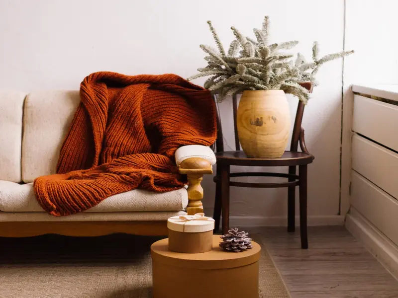
4. Warm and Cozy Hues
Warm and cozy hues can make small spaces feel inviting and intimate. These colors add warmth and comfort to any room.
Key Shades:
- Warm Beige: A timeless and versatile shade, warm beige adds warmth without making the space feel smaller. Learn more on Country Living.
- Terracotta: Rich and earthy, terracotta adds a cozy and grounded feel to small spaces. Find inspiration on Dwell.
- Warm Gray: A perfect blend of warm and neutral, warm gray creates a sophisticated and inviting atmosphere. Explore more on Elle Decor.
- Soft Taupe: Elegant and understated, soft taupe brings warmth and depth to any room. Discover more on The Spruce.

How to Use:
- Layering: Layer different warm hues to create a rich and dynamic look.
- Contrast: Pair warm colors with lighter shades to add contrast and prevent the room from feeling too heavy.
- Textiles: Use warm-colored textiles like rugs, cushions, and throws to enhance the cozy feel.
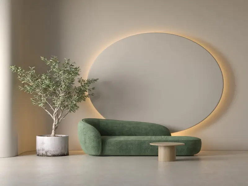
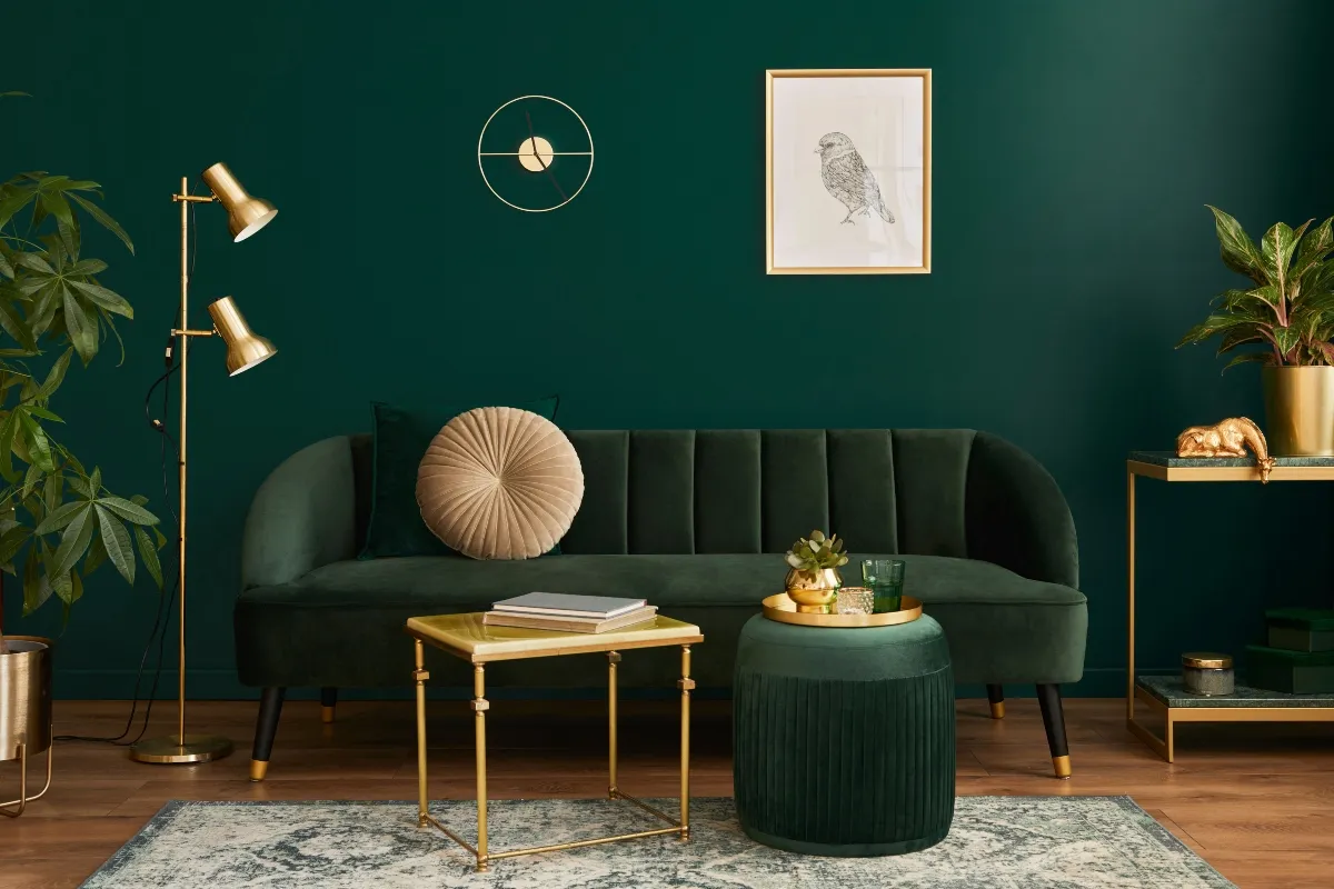
5. Bold and Dramatic Colors
While it’s often recommended to use light colors in small spaces, bold and dramatic colors can also work beautifully when used strategically. These colors add personality and create a striking visual impact.
Key Shades:
- Navy Blue: Deep and sophisticated, navy blue adds depth and elegance to small spaces. Learn more on Architectural Digest.
- Emerald Green: Rich and luxurious, emerald green creates a dramatic and opulent atmosphere. Find inspiration on Elle Decor.
- Charcoal Gray: Sleek and modern, charcoal gray adds a touch of drama and sophistication. Explore more on HGTV.
- Deep Purple: Bold and regal, deep purple makes a statement and adds a sense of luxury. Discover more on House Beautiful.
How to Use:
- Feature Walls: Use bold colors on a feature wall to create a focal point without overwhelming the space.
- Ceilings: Consider painting the ceiling a bold color for a unique and unexpected touch.
- Complementary Decor: Balance bold walls with lighter furniture and decor to create contrast and harmony.
6. Light Reflective Colors
Light reflective colors are designed to bounce light around the room, making it feel brighter and more spacious. These colors are ideal for small spaces with limited natural light.
Key Shades:
- Light Reflective White: A specially formulated white that maximizes light reflection. Learn more on Sherwin-Williams.
- Pearl Gray: A soft and luminous gray that enhances the room’s brightness. Find inspiration on Behr.
- Silver: A subtle metallic shade that adds a touch of shimmer and reflects light. Explore more on Benjamin Moore.
- Champagne: A warm and reflective neutral that adds elegance and brightness. Discover more on Dunn-Edwards.
How to Use:
- Entire Room: Paint the entire room in a light reflective color to maximize the effect.
- Ceiling and Trim: Use light reflective colors on the ceiling and trim to enhance the room’s brightness.
- Mirrors: Incorporate mirrors and reflective surfaces to amplify the light-reflecting effect.
7. Earthy and Natural Tones
Earthy and natural tones bring the beauty of the outdoors inside and create a serene and grounding atmosphere. These colors work well in small spaces by adding warmth and depth.
Key Shades:
- Sage Green: A soothing and natural shade that brings a touch of nature indoors. Learn more on Southern Living.
- Clay: A warm and earthy tone that adds a rustic and organic feel. Find inspiration on Country Living.
- Moss: A rich and deep green that creates a sense of tranquility and connection to nature. Explore more on The Spruce.
- Sand: A light and neutral earthy tone that adds warmth and softness. Discover more on HGTV.
How to Use:
- Accent Walls: Use earthy tones on an accent wall to add depth and interest.
- Natural Materials: Pair earthy colors with natural materials like wood and stone for a cohesive look.
- Indoor Plants: Incorporate indoor plants to enhance the natural and organic feel.
8. Monochromatic Schemes
A monochromatic color scheme uses varying shades of a single color to create a cohesive and harmonious look. This approach can make a small space feel more unified and visually appealing.
Key Shades:
- Light to Dark Blue: Use a range of blue shades from light sky blue to deep navy. Learn more on Houzz.
- Neutral Grays: Explore different shades of gray from light silver to charcoal. Find inspiration on Apartment Therapy.
- Soft Beiges: Use varying shades of beige to create a warm and inviting atmosphere. Explore more on The Spruce.
- Green Spectrum: Incorporate shades of green from pale mint to deep forest green. Discover more on Better Homes & Gardens.
How to Use:
- Gradient Walls: Create a gradient effect on the walls by blending different shades of the same color.
- Layering: Layer different shades of the chosen color in furniture, textiles, and decor.
- Texture: Add texture to the monochromatic scheme with different materials and finishes.
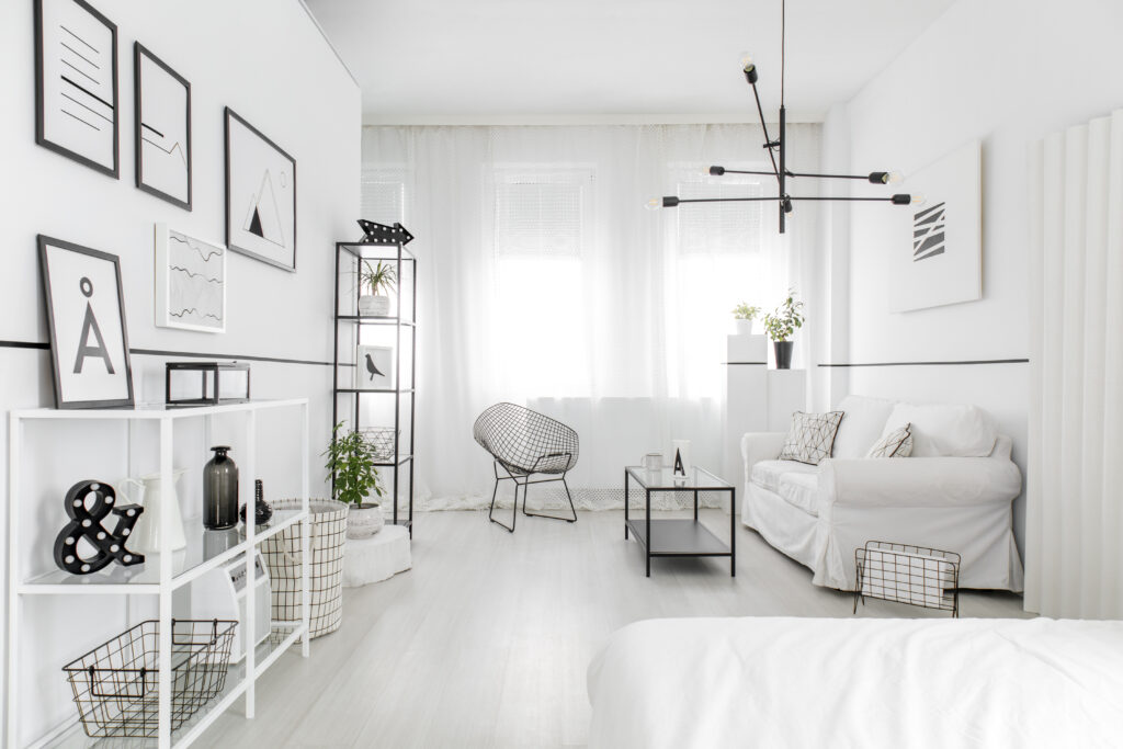
9. Light and Airy Whites
While it may seem simple, white comes in many variations that can subtly affect the ambiance of a small space. Choosing the right shade of white can enhance the room’s brightness and create a clean and fresh look.
Key Shades:
- Pure White: A true white with no undertones, perfect for a crisp and clean look. Learn more on Sherwin-Williams.
- Warm White: A white with warm undertones that adds a touch of coziness. Find inspiration on Benjamin Moore.
- Cool White: A white with cool undertones that creates a modern and refreshing feel. Explore more on Behr.
- Soft White: A white with a hint of cream that adds softness and warmth. Discover more on Dunn-Edwards.
How to Use:
- Walls and Ceilings: Use white on walls and ceilings to create a seamless and open look.
- Trim and Molding: Paint trim and molding in a slightly different shade of white for subtle contrast.
- Decor: Incorporate white furniture and decor to enhance the light and airy feel.
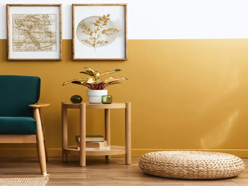
10. Two-Tone Combinations
Two-tone color schemes use two complementary colors to create contrast and visual interest. This approach can add depth and dimension to small spaces.
Key Combinations:
- Navy and White: A classic combination that creates a crisp and sophisticated look. Learn more on Country Living.
- Gray and Yellow: A modern and cheerful pairing that adds warmth and brightness. Find inspiration on HGTV.
- Green and Beige: A natural and calming combination that brings the outdoors inside. Explore more on House Beautiful.
- Blue and Coral: A vibrant and playful pairing that adds energy and personality. Discover more on Better Homes & Gardens.
How to Use:
- Half-Wall Painting: Paint the lower half of the wall one color and the upper half another for a stylish and modern look.
- Accent Walls: Use one color for the main walls and a complementary color for an accent wall.
- Furniture Contrast: Use one color for the walls and a different color for the furniture to create contrast.
Tips for Choosing and Using Paint Colors in Small Spaces
Choosing and using paint colors effectively can enhance the overall look and feel of small spaces. Here are some additional tips to help you make the best choices:
1. Consider Natural Light
The amount and quality of natural light in a room can significantly impact how paint colors appear. Rooms with ample natural light can handle darker and bolder colors, while rooms with limited natural light may benefit from lighter and brighter shades. Learn more on Sherwin-Williams.
2. Test Paint Samples
Before committing to a color, test paint samples on the walls to see how they look in different lighting conditions. This will help you make an informed decision and avoid any unexpected surprises. Find more tips on The Spruce.
3. Use Color Flow
Create a sense of continuity and flow by using similar or complementary colors in adjacent rooms. This approach can make small spaces feel more connected and cohesive. Learn more on Better Homes & Gardens.
4. Add Accents and Accessories
Enhance the chosen paint colors with matching or complementary accessories like cushions, rugs, and artwork. This will create a harmonious and well-coordinated look. Explore more ideas on Elle Decor.
5. Don’t Be Afraid to Experiment
While light and neutral colors are generally recommended for small spaces, don’t be afraid to experiment with bolder shades and creative techniques. With the right balance and execution, bold colors can add personality and style to small spaces. Find more inspiration on Dwell.
Conclusion
Choosing the best paint colors for small spaces can transform your home into a spacious, inviting, and stylish environment. Whether you prefer light and bright neutrals, cool blues and greens, soft pastels, or bold and dramatic colors, there are plenty of options to suit your taste and needs. By considering factors like natural light, testing paint samples, and using effective techniques, you can create a beautiful and cohesive space that feels larger and more welcoming. Happy painting!